Introduction to Clinical Data Science at TTSI
This is a demonstration of how R Markdown can be used to generate reports and visualizations relevant to clinical data science. At TTSI, we specialize in study simulations, sample size estimation, and live anomaly detection. Markdown allows us to format reports that are dynamic and reproducible.
You can embed an R code chunk like this to perform basic data analysis, for example:
# Load the ToothGrowth dataset
data(ToothGrowth)
# Inspect the first few rows
head(ToothGrowth)
## len supp dose
## 1 4.2 VC 0.5
## 2 11.5 VC 0.5
## 3 7.3 VC 0.5
## 4 5.8 VC 0.5
## 5 6.4 VC 0.5
## 6 10.0 VC 0.5
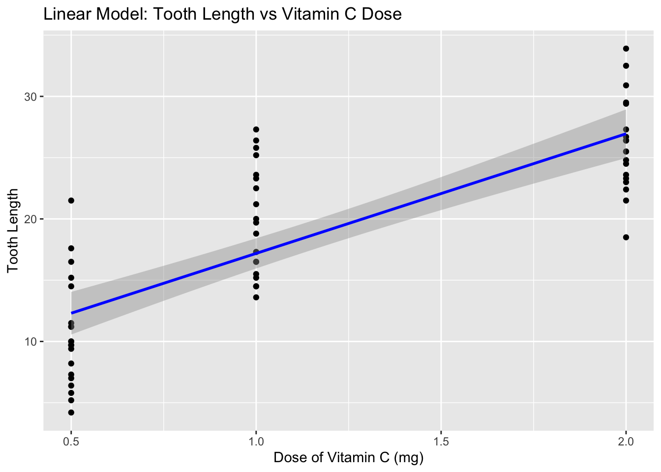
# Fit a linear model to predict tooth length based on the dose of vitamin C
fit <- lm(len ~ dose, data = ToothGrowth)
fit |>
broom::tidy() |>
knitr::kable(digits = 2)
| term | estimate | std.error | statistic | p.value |
|---|---|---|---|---|
| (Intercept) | 7.42 | 1.26 | 5.89 | 0 |
| dose | 9.76 | 0.95 | 10.25 | 0 |
Including Visualizations
At TTSI, visualizations are essential for interpreting complex data from clinical trials. Below is a sample pie chart (Figure ??) demonstrating a common method for displaying categorical data distributions, like treatment groups in a clinical study.
plot <-
  ggplot(ToothGrowth, aes(x = dose, y = len)) +
  geom_point() +  # Add points for the raw data
  geom_smooth(method = "lm", col = "blue") +  # Add the linear model line
  labs(title = "Linear Model: Tooth Length vs Vitamin C Dose",
       x = "Dose of Vitamin C (mg)",
       y = "Tooth Length")
plot
## `geom_smooth()` using formula = 'y ~ x'
Conclusion
This document showcases how R Markdown can be effectively utilized at TTSI for producing clinical reports, visualizations, and data analysis outputs that are dynamic and reproducible.